How many of you have seen the movie “Julie & Julia” from 2009? Chances are, many of you have. The movie shares the story of Julia Child’s entry into the cooking profession and a blogger’s drive to make all the recipes from Child’s very first cookbook. Child was known as a culinary revolutionary here in the States, and in addition to her amazing ability to cook up a storm, she also knew a thing or two about designing a highly functional kitchen, which people are still learning from today as her Cambridge, Massachusetts kitchen and all of its contents were donated to the Smithsonian in 2004.
Child’s functional kitchen was donated to the Smithsonian in 2014.
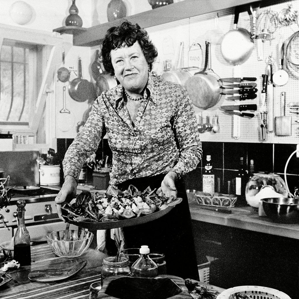
AP/REX/SHUTTERSTOCK
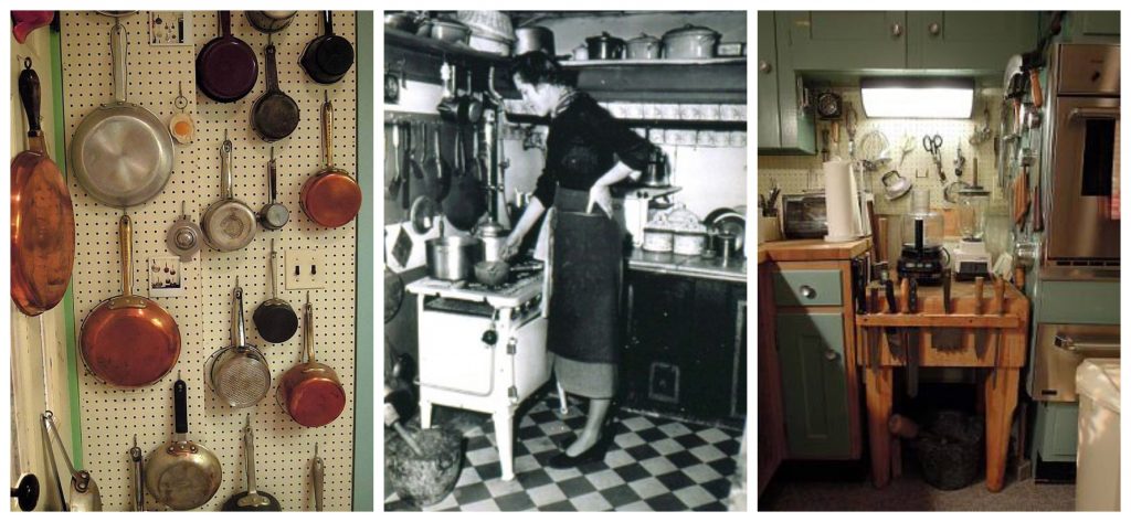
Photo by Paul Child. Courtesy of Schlesinger Library, Radcliffe Institute, Harvard University | The National Museum of American History
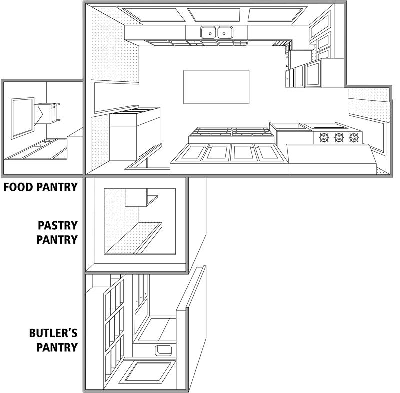
Julia and Paul Child designed this kitchen when they moved into their home in Cambridge, Massachusetts, in 1961. They had been living abroad for more than a decade due to Paul’s work as a cultural attaché with the United States Information Service. After living in Paris, Marseilles, Germany, and Norway, Julia and Paul were ready to set up a kitchen of their own. Julia organized her kitchen around work zones, making sure tools and equipment were placed near the surfaces where they would be used. Her pots, pans, and utensils are near the stove, her knives are near the sink, and her small appliances are set on solid work surfaces, ready to use. – The National Museum of American History
As we all adjust to spending more time at home and in our kitchens over the next weeks, we thought we would share some of the kitchen design lessons we have learned from Julia Child.
- The kitchen is a workplace. The lack of frills and designer details in her kitchen serves as a reminder that for a true craftsman, function is all-important. A gorgeous kitchen lifts the spirits, certainly, but the perfect kitchen won’t sacrifice efficiency for style. Open shelving allows for easy access and breaks up big banks of cabinetry – which always adds visual interest.
- Go vertical. If you’ve run out of drawer and cabinet space, use your walls for storage. In addition to pegboards, Julia hung magnetic knife racks between the windows to use every inch of storage space. Everything had purpose.
- Light it right. The Childs had ample lighting installed throughout the kitchen to make day-to-day cooking easier (in addition to task lighting, poles were later mounted on the ceiling-held TV lights). We recommend good overhead lighting with strategically placed cans, task lighting with under counter lights and downlight pendants, and of course overall room lighting with beautiful ceiling lights and chandeliers.
- Julia was of the belief that surface selection in a kitchen is vital to how the workspace functions. Countertops must be durable and highly cleanable as well as beautiful. The selections have expanded beyond simple tile and include a multitude of man-made solid surfaces, tile, stone, and wood.
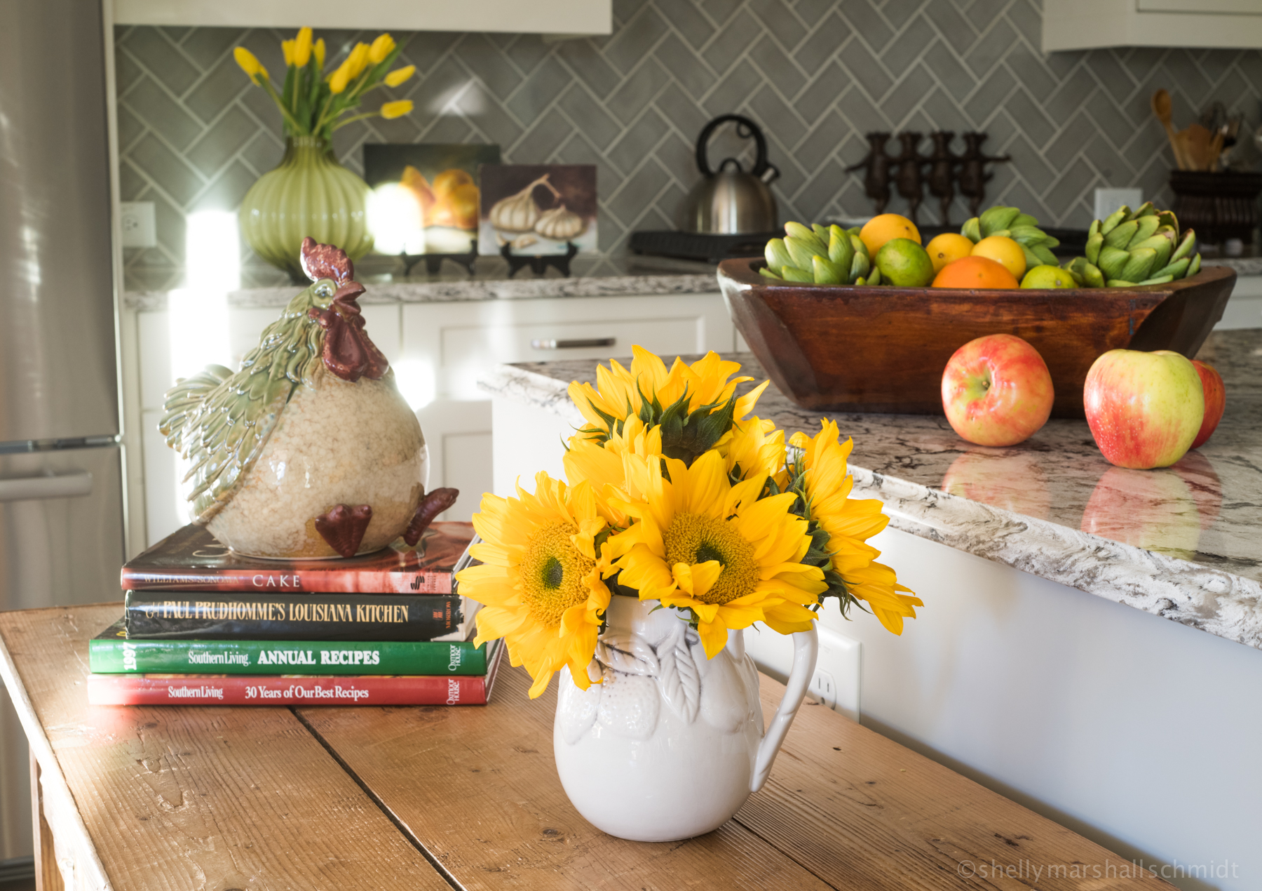
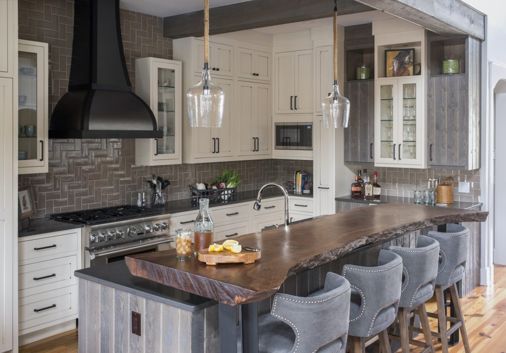
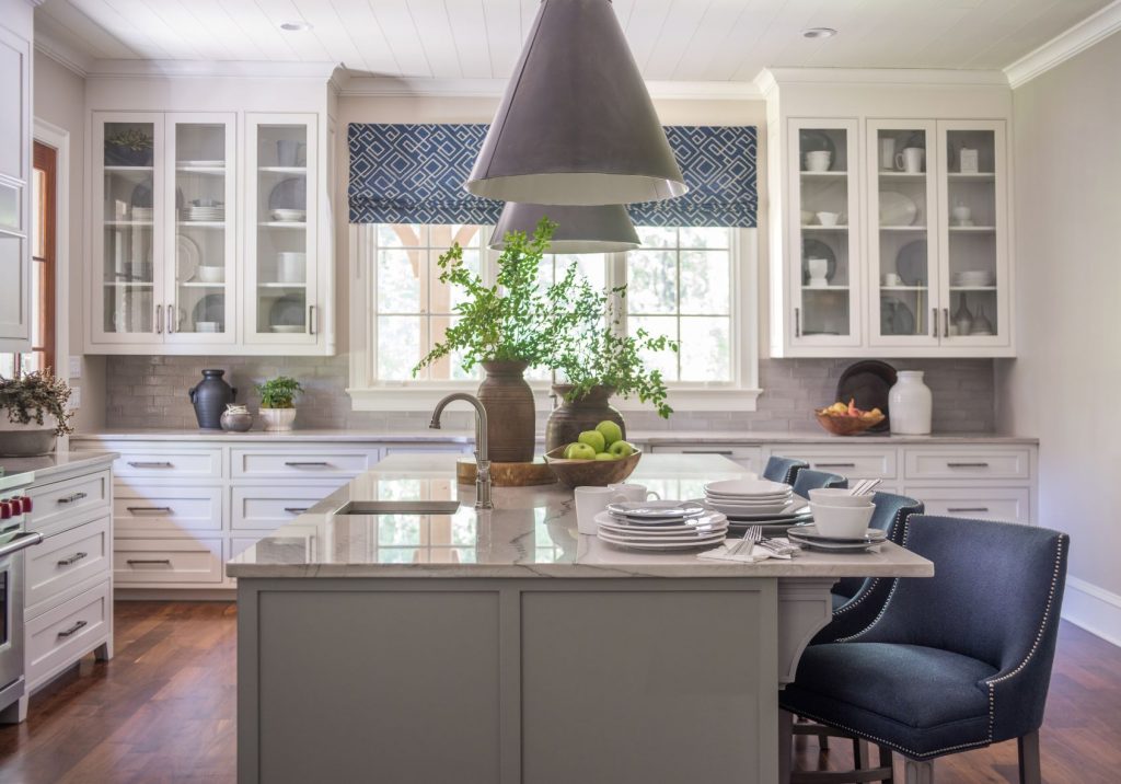
Feeling inspired, we went into our photo archives to bring you some of our favorite functional kitchens designed or styled by Nandina Home and Design!
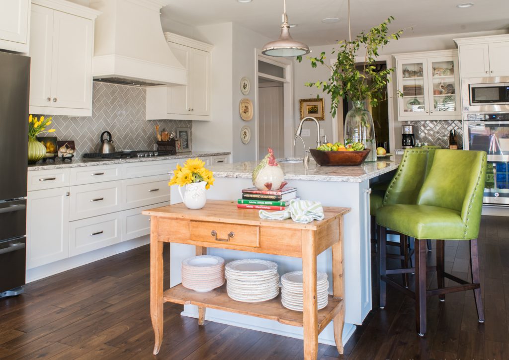
Kitchen designed by Jessie LaFalce of Nandina Home & Design | Photography by Shelly Schmidt
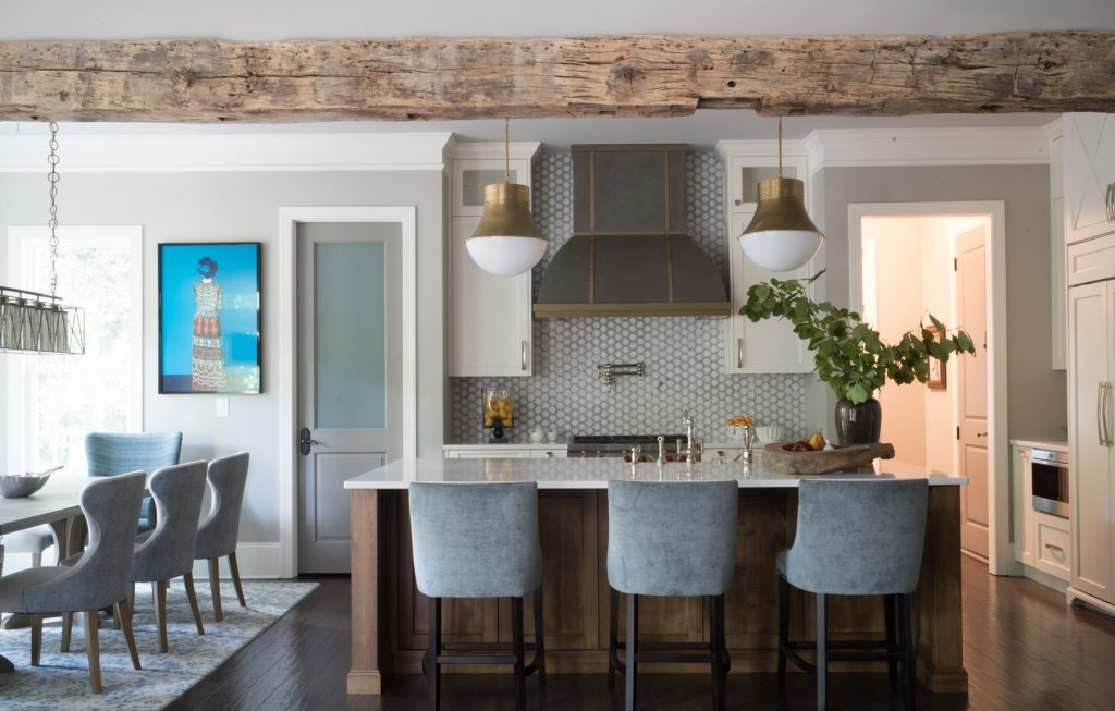
Kitchen designed by John Ishmael of Nandina Home & Design | Photography by Shelly Schmidt
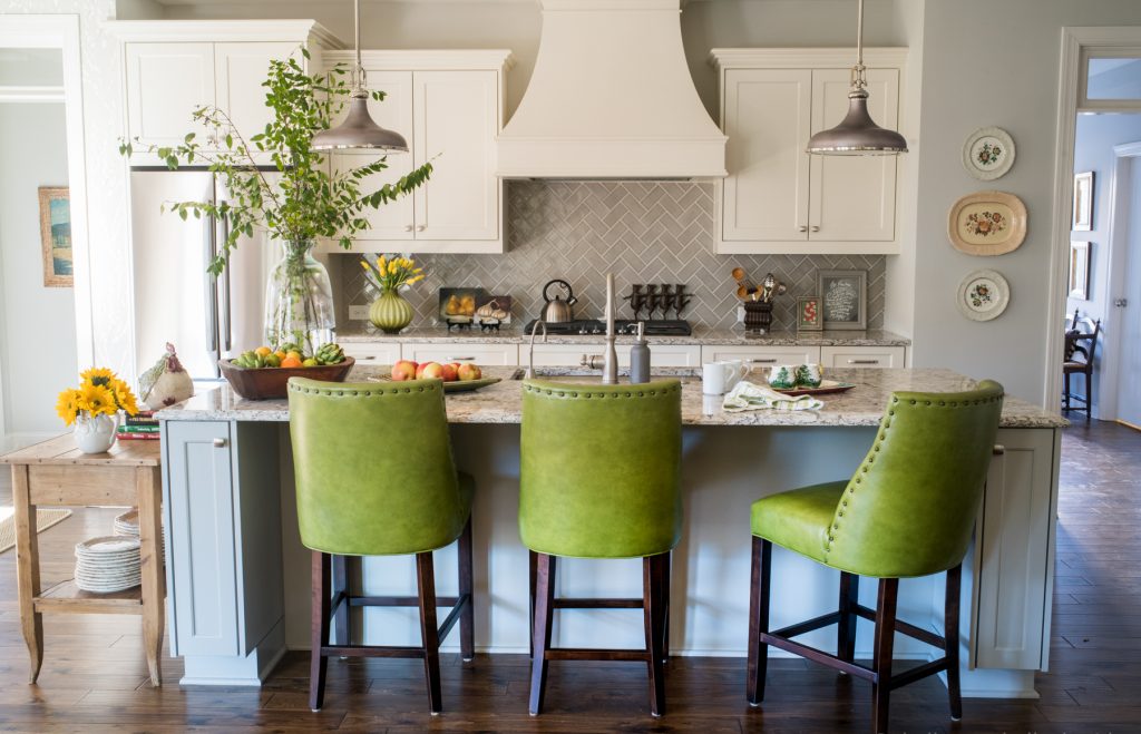
Kitchen designed by Jessie LaFalce of Nandina Home and Design | Photography by Shelly Schmidt
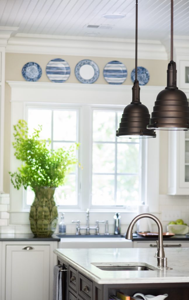
Kitchen designed by Sue Shannon of Nandina Home & Design | Photography by Shelly Schmidt
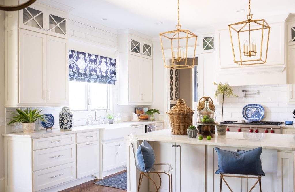
Kitchen styled by Sue Shannon of Nandina Home and Design | Photography by Shelly Schmidt
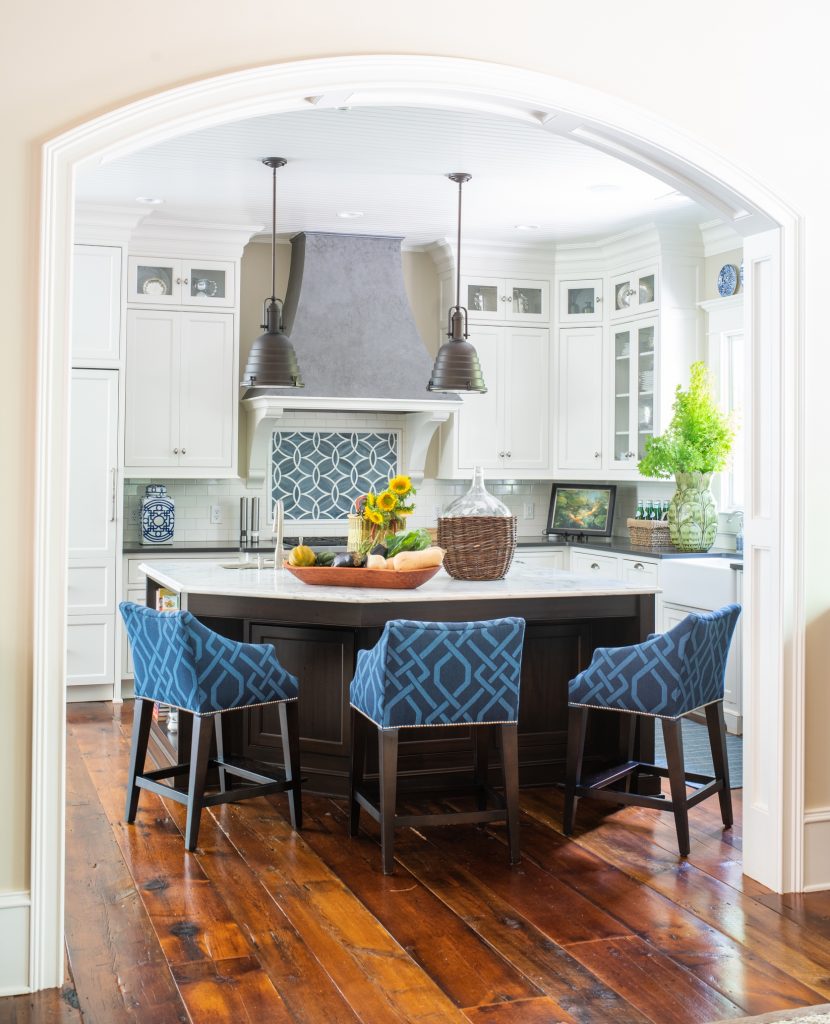
Kitchen design by Sue Shannon of Nandina Home and Design | Photography by Shelly Schmidt
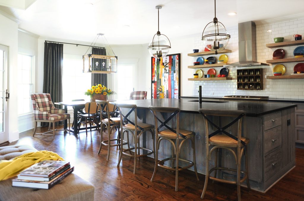
Kitchen designed by Susan Victor and Sue Shannon of Nandina Home & Design | Photography by Shelly Schmidt
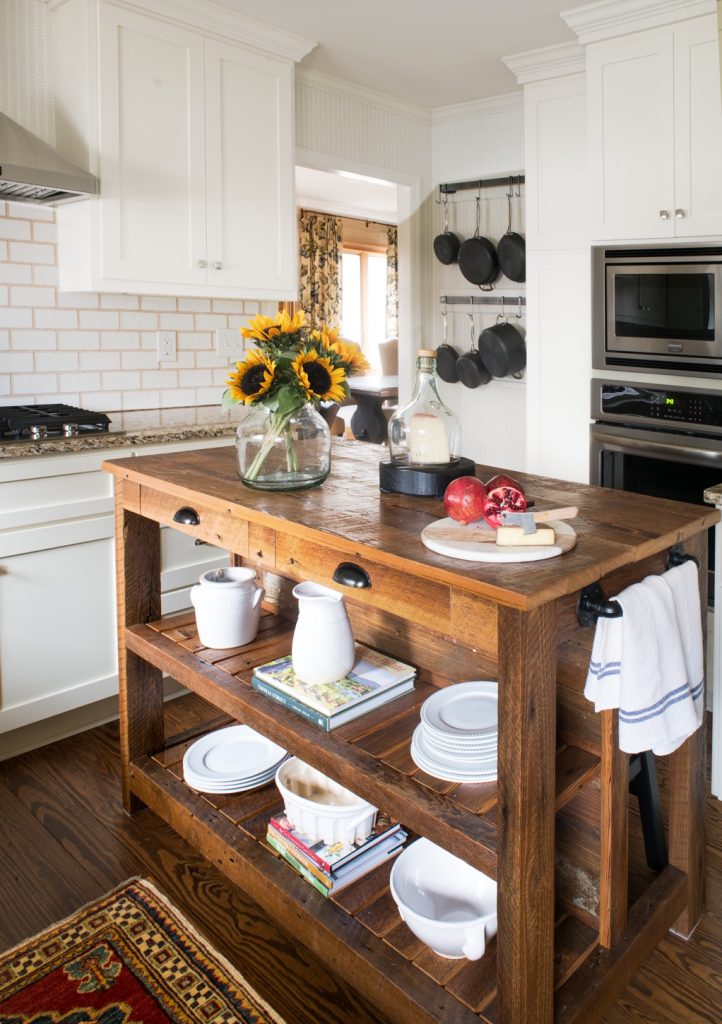
Kitchen styled by Susan Victor of Nandina Home and Design | Photography by Shelly Schmidt
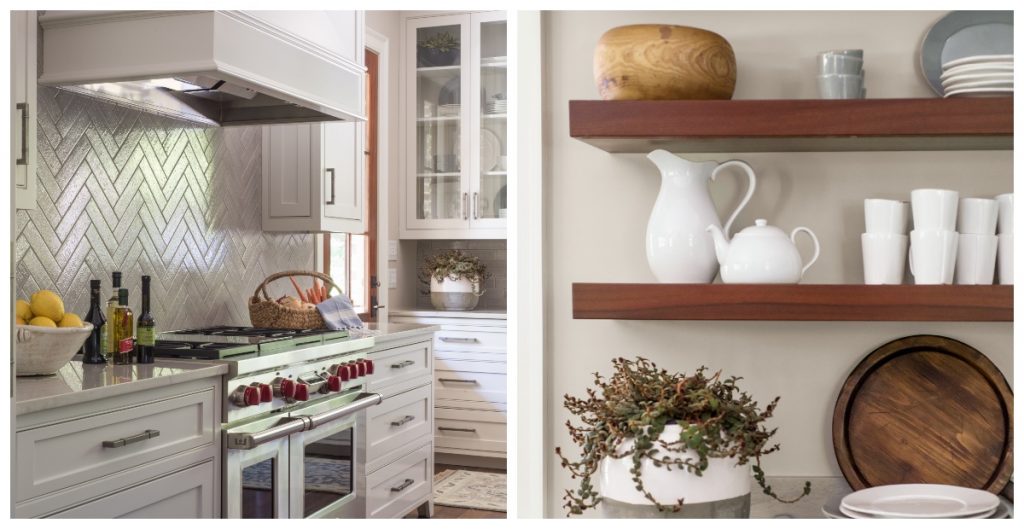
Kitchen designed by Susan Victor | Photography by Shelly Schmidt


