As interior designers the use of color is one of the most critical design tools that we can use, and at Nandina we love color. Here are some of our tried and true tips on how to use color to create amazing spaces in every design project.
Start with a Color Palette
Choose a color palette that suits your interior design style and the mood you want to create in the room. Picking the right colors isn’t just about what looks pretty (although that’s a big part of it!). Consider the overall theme, the purpose of the space, and your personal preferences. You can create a monochromatic scheme using various shades of a single color, or opt for complementary or analogous colors for a more vibrant look. Complementary and analogous colors are concepts that are part of the overall field of “color theory”.
Use a Color Wheel
If choosing colors feels complicated then meet your new best friend the color wheel – it’s like your ultimate color cheat sheet. Opposite colors on the wheel, like red and green, are called complementary colors. They’re like a match made in color heaven, bringing out the best in each other. And then there are analogous colors, which are neighbors on the wheel. They play so well together, creating a harmonious and seamless look.
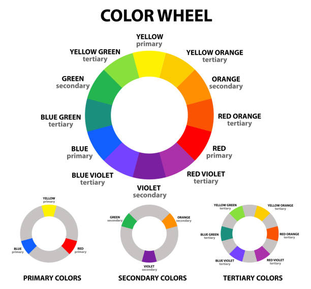
The color wheel – your new best friend
Use Color to Set the Mood
Different colors evoke different emotions and moods. Imagine walking into a room that’s like a warm hug – cozy, inviting, and just feels right. That’s the magic of color psychology! Each color has its own personality, and it can totally affect your mood. Warm colors like reds, oranges, and yellows bring in energy and excitement. They’re like that friend who’s always up for an adventure. But if you’re all about chill vibes and tranquility, cool colors like blues and greens are your go-to pals. They create a calm and serene atmosphere – perfect for those lazy Sunday mornings with a book and a cup of tea.
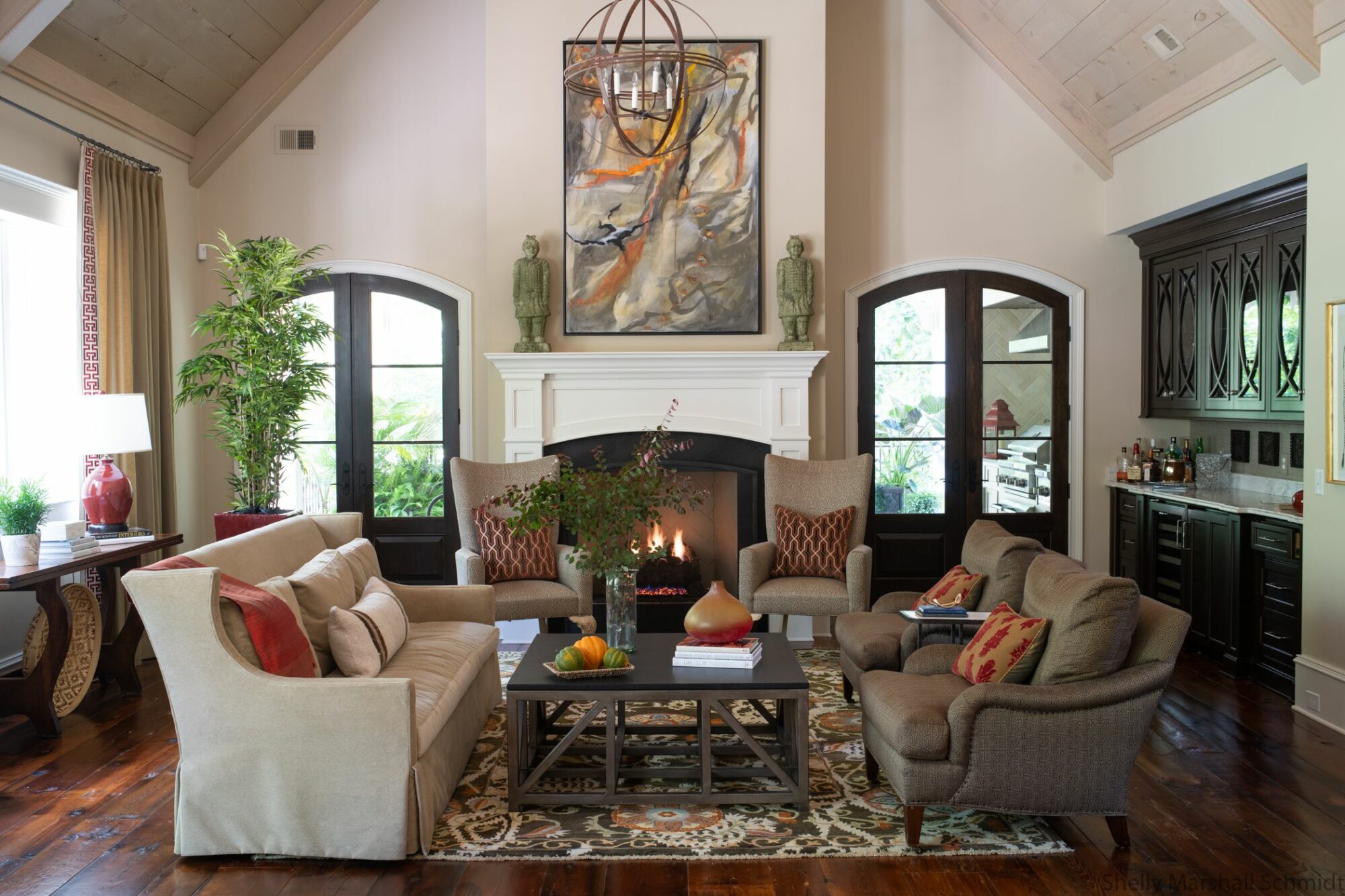
The reds and oranges scattered throughout this room are warm and inviting and give the room energy
Balance Bold and Neutral Colors
If you want to incorporate bold or vibrant colors into your space, balance them with neutral colors. Neutrals like white, beige, gray, or taupe can serve as a backdrop that allows your accent colors to shine. This balance helps prevent the space from becoming overwhelming and ensures a cohesive look.
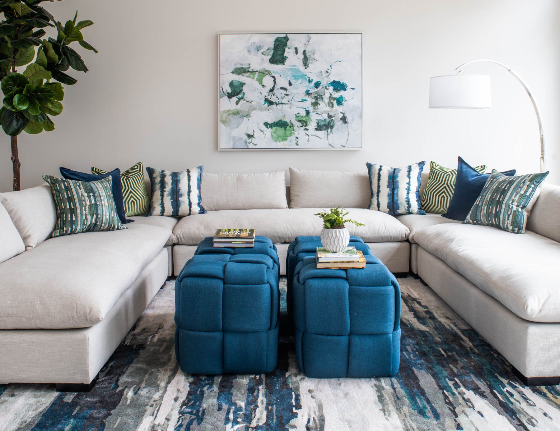 The large white sectional and white walls are the perfect backdrop to the vibrant blues and greens in the pillows, art and rug in this playful den
Don’t Be Afraid to Go Monochromatic
Ever heard of monochromatic magic? It’s all about sticking to shades of a single color. Picture a room dressed in various shades of blue – from pale sky to deep navy. It’s a classy and sophisticated look that’s easy on the eyes.
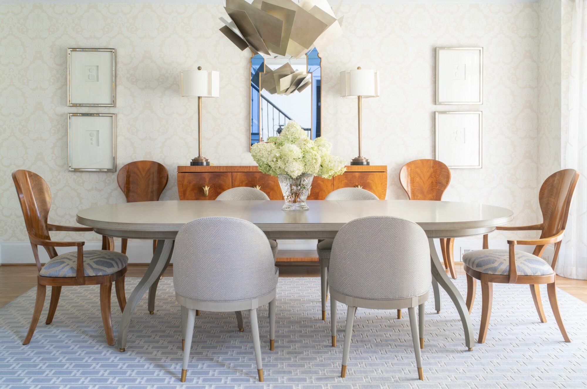 This monochromatic dining room screams sophistication with multiple shades of gray, textured wallpaper and a stunning chandelier that pulls it all together
Experiment with Textures
Colors can interact with different textures to create visual interest. Play with a variety of materials such as velvet, silk, wood, or metal, as they can add depth and richness to your color scheme. Textured surfaces can also reflect light differently, altering the perception of color in a space.
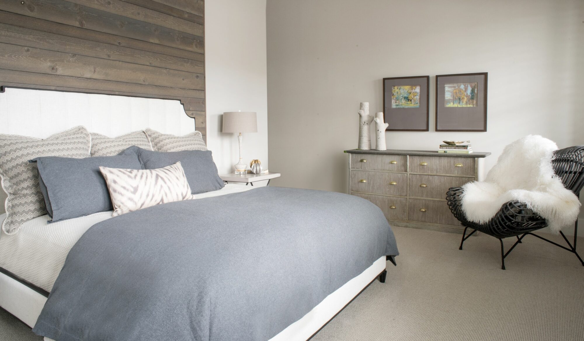 This monochromatic bedroom could have fallen flat, instead a textured wood paneled wall, a sculptural ratan chair and a large furry hide add the change in materials that make this room interesting and inviting
Create Focal Points with Color
Use color to draw attention to specific areas or elements in the room. For instance, you can paint an accent wall in a bold color or use colorful furniture, bold artwork, or brightly colored pillows and accessories to create a focal point. These focal points of color are like those fancy accessories that complete an outfit. They’re the pops of color that add personality to your space.
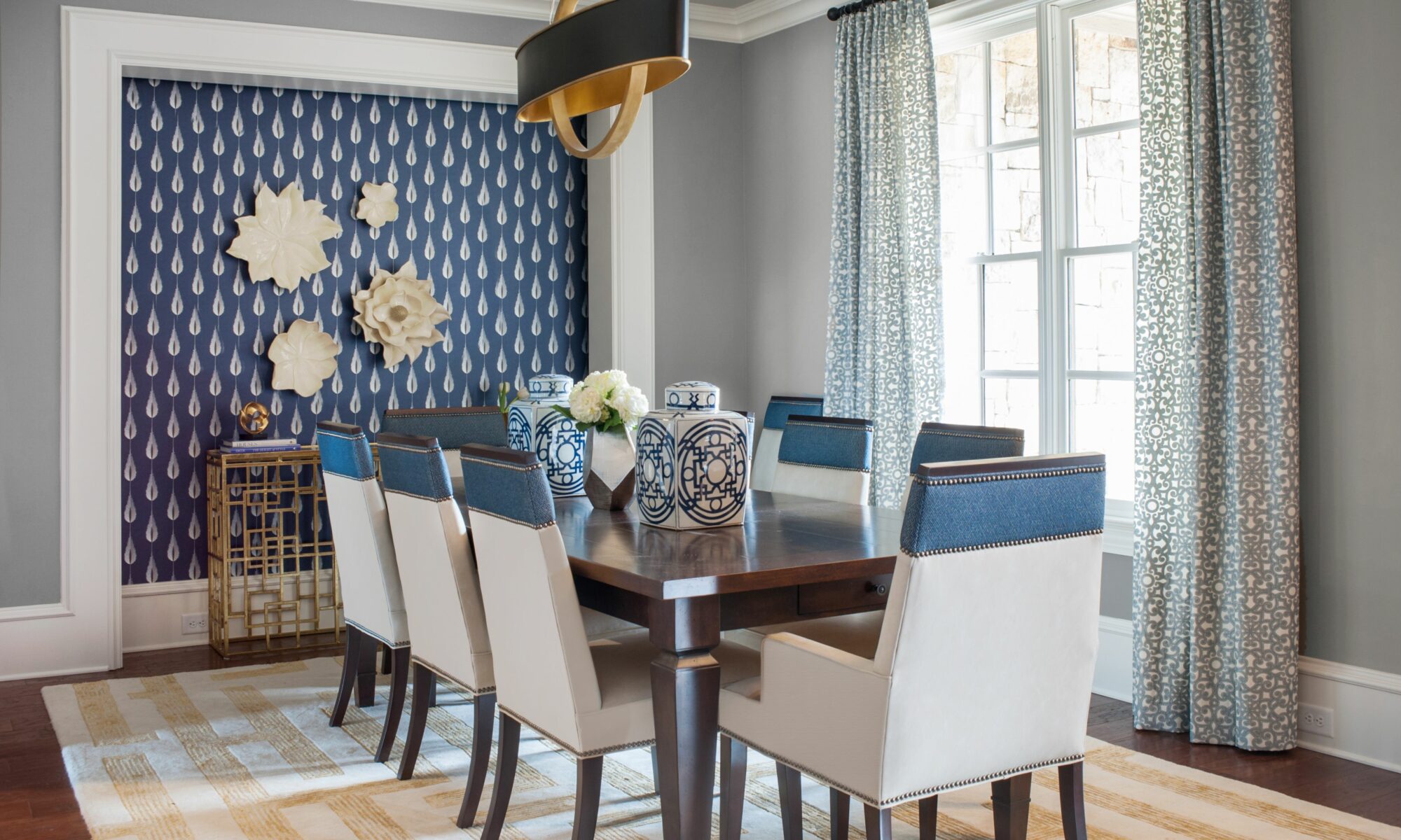 A blue textured wallpaper on one wall that coordinates with the blue leather accents on the dining room chairs create a focal point that harmonizes with the entire design of the room
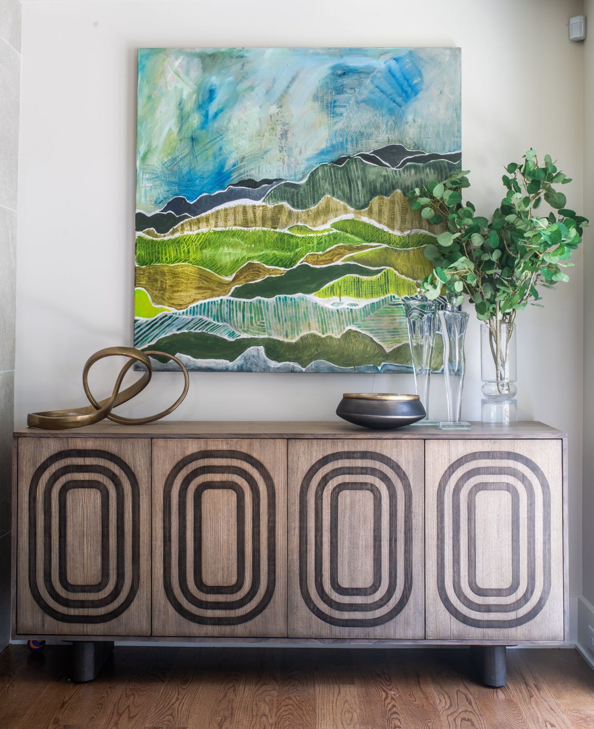 Colorful art is a perfect accessory to any design
Consider the Flow Between Rooms
If your home has an open floor plan or if rooms are visible from one another, consider how colors will flow from one space to another. Choose colors that complement each other or create a harmonious transition between rooms to ensure a cohesive and visually pleasing overall look.
Don’t Forget the Power of the Fifth Wall – Your Ceiling
Painting it a lighter shade can make your room feel more open and spacious. Or if you’re feeling adventurous painting all five walls a vibrant color is a design risk that can really pay off.
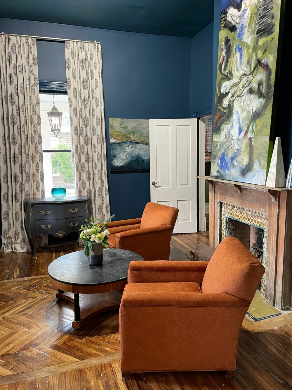 All five walls, along with all trim, are painted a vibrant blue in this saturated room of color.
Now that you’re armed with a bit of color theory magic, go ahead and experiment! Your space is like a canvas, and you’re the artist. Mix and match, try different combinations, and don’t be afraid to let your personality shine through those colors. Need help choosing colors for an interior design project in Aiken, Atlanta, or Greenville? We’d love to help.


